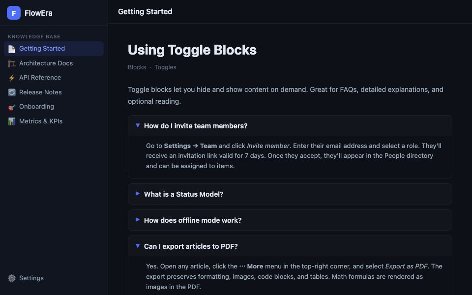
Toggle blocks let you hide content behind a header. Readers expand a block with a single click. Great for FAQ sections, additional details, and content that not everyone needs to read.
Creating a Toggle
- Slash menu:
/toggle→ Enter - Markdown: type
>(arrow + space) at the start of a line
Structure
A toggle block has two parts:
- Header — always visible, clickable
- Content — hidden by default, expands on click
Any block can be nested inside the content: paragraphs, code, lists, images, tables, and even other toggles.
Nested Toggles
▶ Installation
  ▶ macOS
    1. Download the .dmg file
    2. Drag to Applications
  ▶ Windows
    1. Run the installer
    2. Follow the instructions
Any depth is supported, but we recommend no more than 3 levels — deeper structures become hard to navigate.
Default State
By default, all toggle blocks are closed when an article opens. This keeps long FAQ articles compact. Readers see the question list and expand only what they need.
Use Cases
FAQ Section
▶ How do I reset my password?
  Go to Settings → Security → Change Password...

▶ How many team members can I invite?
  On the Team plan — up to 25. Enterprise — unlimited.

▶ How do I export data?
  Use Settings → Export → Download JSON...
Additional Details
In technical articles, toggles are handy for collapsing implementation details not everyone needs:
▶ Technical details (for developers)
  PowerSync uses CRDTs for conflict resolution...
Toggle blocks are indexed by search. Hidden content inside a toggle is found when searching the knowledge base.